第一步是下载Bootstrap和Glyphicons库。你可以找到外部引用Bootstrap CDN主机上的图标字体文件。我分开这些样式表到不同的文件,同时创建一个新的文档称为styles.css。
<!doctype html>
<html lang="en-US">
<head>
<meta charset="utf-8">
<meta http-equiv="Content-Type" content="text/html">
<title>Vertical Responsive Timeline UI - Template Monster Demo</title>
<meta name="author" content="Jake Rocheleau">
<link rel="shortcut icon" href="http://static.tmimgcdn.com/img/favicon.ico">
<link rel="icon" href="http://static.tmimgcdn.com/img/favicon.ico">
<link rel="stylesheet" type="text/css" media="all" href="css/bootstrap.min.css">
<link rel="stylesheet" type="text/css" media="all" href="css/bootstrap-glyphicons.css">
<link rel="stylesheet" type="text/css" media="all" href="css/styles.css">
<script type="text/javascript" src="js/jquery-1.11.0.min.js"></script>
</head>
样式表是基于BS时间轴使用默认的Bootstrap 代码的片段。但是我重新设计布局处理更好的响应技术,也更新更深的UI的配色方案。
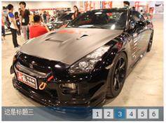
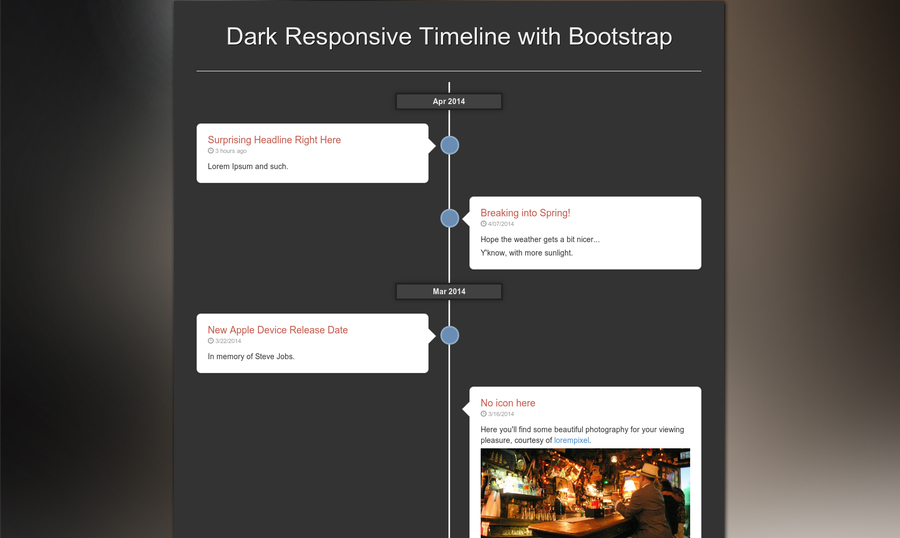
您可能还注意到包括了日期。这有助于单独列出某个月而浏览帖子。每个气泡可以代表一个事件,状态更新,或者简单的博客文章。
Twitter Bootstrap 包含一组默认的类,可以用在任何页面。这个设计包含一个.container div的基于浏览器的宽度扩展或收缩。小标题下你会发现一个无序列表类.timeline。这是使用CSS来创建一个线的中心页面。
<ul class="timeline">
<li><div class="tldate">Apr 2014</div></li>
<li>
<div class="tl-circ"></div>
<div class="timeline-panel">
<div class="tl-heading">
<h4>Surprising Headline Right Here</h4>
<p><small class="text-muted"><i class="glyphicon glyphicon-time"></i> 3 hours ago</small></p>
</div>
<div class="tl-body">
<p>Lorem Ipsum and such.</p>
</div>
</div>
</li>
<li class="timeline-inverted">
<div class="tl-circ"></div>
<div class="timeline-panel">
<div class="tl-heading">
<h4>Breaking into Spring!</h4>
<p><small class="text-muted"><i class="glyphicon glyphicon-time"></i> 4/07/2014</small></p>
</div>
<div class="tl-body">
<p>Hope the weather gets a bit nicer...</p>
<p>Y'know, with more sunlight.</p>
</div>
</div>
</li>
从这里很容易理解每个气泡是如何创建的。列表项代表对象的时间轴,我们可以通过附加指定到对面。timeline-inverted类。列表项将几乎相同。
.tl-circ是一个空的div创建蓝色的圈图标。.timeline-panel包含气泡本身使用一些详细的CSS伪元素的箭头。注意我们使用Glyphicons也将为每个帖子创建时钟图标
没有任何特定的规则如何需要设置每个项目时间轴。一些项目可能会有蓝色的圆圈图标但不是必要的。你也可以添加类.noarrow到时间轴面板完全删除箭头。这是一个非常灵活的设计有很多的定制空间。
页面样式
自Bootstrap 提供了默认样式我们不需要从头开始创建很多。我已经更新了页面背景是黑色,标题文本颜色也已更新。不设置默认图像响应,所以我们通过添加max-width:100%做到这一点。
body { background: #333; }
img { border: 0; max-width: 100%; }
.page-header h1 {
font-size: 3.26em;
text-align: center;
color: #efefef;
text-shadow: 1px 1px 0 #000;
}
/** timeline box structure **/
.timeline {
list-style: none;
padding: 20px 0 20px;
position: relative;
}
.timeline:before {
top: 0;
bottom: 0;
position: absolute;
content: " ";
width: 3px;
background-color: #eee;
left: 50%;
margin-left: -1.5px;
}
.tldate {
display: block;
width: 200px;
background: #414141;
border: 3px solid #212121;
color: #ededed;
margin: 0 auto;
padding: 3px 0;
font-weight: bold;
text-align: center;
-webkit-box-shadow: 0 0 11px rgba(0,0,0,0.35);
}
.timeline li {
margin-bottom: 25px;
position: relative;
}
由于布局是响应时我们只看到它集中超过几百个像素。当降至更小的分辨率时间表将修复一侧和箱子将调整宽度。
/** timeline panels **/
.timeline li .timeline-panel {
width: 46%;
float: left;
background: #fff;
border: 1px solid #d4d4d4;
padding: 20px;
position: relative;
-webkit-border-radius: 8px;
-moz-border-radius: 8px;
border-radius: 8px;
-webkit-box-shadow: 0 1px 6px rgba(0, 0, 0, 0.15);
-moz-box-shadow: 0 1px 6px rgba(0, 0, 0, 0.15);
box-shadow: 0 1px 6px rgba(0, 0, 0, 0.15);
}
/** panel arrows **/
.timeline li .timeline-panel:before {
position: absolute;
top: 26px;
right: -15px;
display: inline-block;
border-top: 15px solid transparent;
border-left: 15px solid #ccc;
border-right: 0 solid #ccc;
border-bottom: 15px solid transparent;
content: " ";
}
.timeline li .timeline-panel:after {
position: absolute;
top: 27px;
right: -14px;
display: inline-block;
border-top: 14px solid transparent;
border-left: 14px solid #fff;
border-right: 0 solid #fff;
border-bottom: 14px solid transparent;
content: " ";
}
.timeline li .timeline-panel.noarrow:before, .timeline li .timeline-panel.noarrow:after {
top:0;
right:0;
display: none;
border: 0;
}
.timeline li.timeline-inverted .timeline-panel {
float: right;
}
.timeline li.timeline-inverted .timeline-panel:before {
border-left-width: 0;
border-right-width: 15px;
left: -15px;
right: auto;
}
.timeline li.timeline-inverted .timeline-panel:after {
border-left-width: 0;
border-right-width: 14px;
left: -14px;
right: auto;
}
在个人时间轴面板中可以看到每个箭头设计是如何创建的。使用:before 和after 也可以使用CSS没有任何图像生成的箭头。它还意味着.noarrow类很容易创建只有扭转的属性和完全消除箭头。
每个面板自然定位到左边内容来自从左到右。但随着.timeline-inverted类它迫使个别项目浮动到右侧。
响应的CSS
最后一部分style.css文档响应设计。我只设置两个独特的断点,定义这个接口的关键领域。
首先在991px我更新时间轴面板宽度从46%降至44%。随着页面宽度下降较小的时间轴盒子靠近中心,但呆在相同的宽度。这意味着我们发现箭重叠的蓝色圆圈图标和看起来笨重。调整宽度很容易解决这个问题。
/** media queries **/
@media (max-width: 991px) {
.timeline li .timeline-panel {
width: 44%;
}
}
@media (max-width: 700px) {
.page-header h1 { font-size: 1.8em; }
ul.timeline:before {
left: 40px;
}
.tldate { width: 140px; }
ul.timeline li .timeline-panel {
width: calc(100% - 90px);
width: -moz-calc(100% - 90px);
width: -webkit-calc(100% - 90px);
}
ul.timeline li .tl-circ {
top: 22px;
left: 22px;
margin-left: 0;
}
ul.timeline > li > .tldate {
margin: 0;
}
ul.timeline > li > .timeline-panel {
float: right;
}
ul.timeline > li > .timeline-panel:before {
border-left-width: 0;
border-right-width: 15px;
left: -15px;
right: auto;
}
ul.timeline > li > .timeline-panel:after {
border-left-width: 0;
border-right-width: 14px;
left: -14px;
right: auto;
}
}
一旦页面视窗下降或低于700 px,然后时间轴修复本身到左边。页面,而不是集中.timeline调整为小屏幕保持所有的时间轴面板右侧。
这通常更容易理解,因为倒面板看起来就像普通面板。图片仍然可见,仍可点击链接,一切都仍容易阅读。我没有调整字体大小以外的页眉但你可能增加。
关闭
虽然这种效果可能不是在每个网站上是有用的,它肯定是独一无二的,提供了一个相当有趣的经验。随着时间的推移,我们可能会注意到设计师会向这一清洁组织画廊的内容趋势。随意下载我的源代码,这种设计可以使用在未来的web项目。