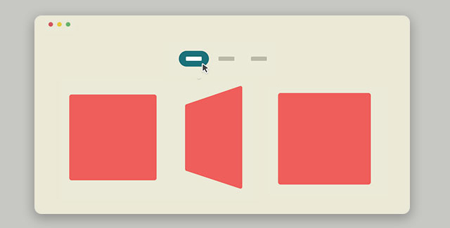
一款炫酷的jQuery和css3弹性3d图片翻转分组展示特效。内容分组过滤对于一些网站来说是非常重要的,如商务网站和图片站。如何使组图片切换时不必刷新网页呢?最好的方法是使用CSS3 3D Transforms来在用户选择某组类别时翻转图片。这款插件在IE9以下的IE浏览器中看不到效果。 HTML html结构使用一个nav作为wrapper,在里面使用无序列表作为分组图片。在插件中只用三个分组,但是你会发现使用了4个列表项,第一个列表项是一个占位,它将被用来在移动设备上制作选择按钮(通过jQuery)。在大屏幕上这个占位将被移除(display:none)。<nav> <ul> <li class="placeholder"> <a href="#0">Option 1</a> <!-- default option on mobile --> </li> <li> <a href="#0">Option 1</a> </li> <li> <a href="#0">Option 2</a> </li> <li> <a href="#0">Option 3</a> </li> </ul> </nav>在每个分组中,又使用一个无序列表来作为图片画廊。这个无序列表的ul元素将被用于旋转,它里面的li元素将和它一起呗旋转。<ul> <li> <ul> <!-- this is the element that will rotate --> <li> <img src="img/thumb-1.jpg" alt="thumbnail"> </li> <li> <img src="img/thumb-2.jpg" alt="thumbnail"> </li> <li> <img src="img/thumb-3.jpg" alt="thumbnail"> </li> </ul> </li> <li> <ul> <!-- this is the element that will rotate --> <li> <img src="img/thumb-1.jpg" alt="thumbnail"> </li> <li> <img src="img/thumb-2.jpg" alt="thumbnail"> </li> <li> <img src="img/thumb-3.jpg" alt="thumbnail"> </li> </ul> </li> <!-- ... --> </ul>CSS 包含图片的无序列表的第一个列表项是可见的,我们给它class.is-visible。li.is-visible { /* the front item, visible by default */ position: relative; z-index: 5; }在同一个无序列表中,将使用绝对定位,这意味着其他列表项的高度将依赖与第一个列表项的高度。 另外两个class是 .is-hidden 和 .is-selected 。 .is-hidden 将隐藏所有的列表项。 .is-selected 将使被选择的分组被显示。注意:这里使用CSS3 transformation(180deg rotation)来旋转ul元素。li.is-hidden { /* the hidden items, right behind the front one */ position: absolute; top: 0; left: 0; height: 100%; width: 100%; z-index: 1; transform: rotateY(180deg); } li.is-selected { /* the next item that will be visible */ z-index: 3 !important; }当用户点击分组按钮时,我们使用jQuery为ul添加.is-switched来使它旋转。ul.is-switched li.is-visible { transform: rotateY(180deg); animation: cd-rotate 0.5s; } ul.is-switched li.is-hidden { transform: rotateY(0); animation: cd-rotate-inverse 0.5s; opacity: 0; } ul.is-switched li.is-selected { opacity: 1; }使用 CSS3 Animations 来制作弹性效果,这不会影响到CSS3 transitions的旋转效果。@keyframes cd-rotate { 0% { transform: perspective(800px) rotateY(0); } 70% { /* this s the bounce effect */ transform: perspective(800px) rotateY(200deg); } 100% { transform: perspective(800px) rotateY(180deg); } } @keyframes cd-rotate-inverse { 0% { transform: perspective(800px) rotateY(-180deg); } 70% { transform: perspective(800px) rotateY(20deg); } 100% { transform: perspective(800px) rotateY(0); } }你也许会有些奇怪:为什么不直接将旋转应用到ul元素上?因为那样做需要使用到transform-style: preserve-3d。看起来这样做更简单,但是别忘记了,IE11以下的浏览器不支持transform-style: preserve-3d。jQuery(document).ready(function($){ //wrap each one of your filter in a .cd-gallery-container bouncy_filter($('.cd-gallery-container')); function bouncy_filter($container) { $container.each(function(){ var $this = $(this); var filter_list_container = $this.children('.cd-filter'), filter_values = filter_list_container.find('li:not(.placeholder) a'), filter_list_placeholder = filter_list_container.find('.placeholder a'), filter_list_placeholder_text = filter_list_placeholder.text(), filter_list_placeholder_default_value = 'Select', gallery_item_wrapper = $this.children('.cd-gallery').find('.cd-item-wrapper'); //store gallery items var gallery_elements = {}; filter_values.each(function(){ var filter_type = $(this).data('type'); gallery_elements[filter_type] = gallery_item_wrapper.find('li[data-type="'+filter_type+'"]'); }); //detect click event filter_list_container.on('click', function(event){ event.preventDefault(); //detect which filter item was selected var selected_filter = $(event.target).data('type'); //check if user has clicked the placeholder item (for mobile version) if( $(event.target).is(filter_list_placeholder) || $(event.target).is(filter_list_container) ) { (filter_list_placeholder_default_value == filter_list_placeholder.text()) ? filter_list_placeholder.text(filter_list_placeholder_text) : filter_list_placeholder.text(filter_list_placeholder_default_value) ; filter_list_container.toggleClass('is-open'); //check if user has clicked a filter already selected } else if( filter_list_placeholder.data('type') == selected_filter ) { filter_list_placeholder.text($(event.target).text()) ; filter_list_container.removeClass('is-open'); } else { //close the dropdown (mobile version) and change placeholder text/data-type value filter_list_container.removeClass('is-open'); filter_list_placeholder.text($(event.target).text()).data('type', selected_filter); filter_list_placeholder_text = $(event.target).text(); //add class selected to the selected filter item filter_values.removeClass('selected'); $(event.target).addClass('selected'); //give higher z-index to the gallery items selected by the filter show_selected_items(gallery_elements[selected_filter]); //rotate each item-wrapper of the gallery //at the end of the animation hide the not-selected items in the gallery amd rotate back the item-wrappers // fallback added for IE9 var is_explorer_9 = navigator.userAgent.indexOf('MSIE 9') > -1; if( is_explorer_9 ) { hide_not_selected_items(gallery_elements, selected_filter); gallery_item_wrapper.removeClass('is-switched'); } else { gallery_item_wrapper.addClass('is-switched').eq(0).one('webkitAnimationEnd oanimationend msAnimationEnd animationend', function() { hide_not_selected_items(gallery_elements, selected_filter); gallery_item_wrapper.removeClass('is-switched'); }); } } }); }); } }); function show_selected_items(selected_elements) { selected_elements.addClass('is-selected'); } function hide_not_selected_items(gallery_containers, filter) { $.each(gallery_containers, function(key, value){ if ( key != filter ) { $(this).removeClass('is-visible is-selected').addClass('is-hidden'); } else { $(this).addClass('is-visible').removeClass('is-hidden is-selected'); } }); }