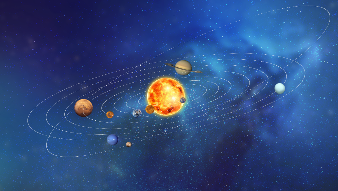
例子
/* 冥王星 */
.orbit.pluto:hover {
    animation-play-state:paused;
}
.orbit.pluto
{
    height: 1000px;
    width: 1000px;
    left: 50%;
    top: -325px;
    margin-left: -430px;
    animation-duration: 110s;
    transform: rotateX(75deg) rotateY(-25deg) rotateZ(90deg);
    animation-name: plutorotate;
}

.orbit.pluto > .planet
{
    height: 20px;
    width: 20px;
    left: 138px;
    bottom: 138px;
}

.orbit.pluto > .planet > .ball
{
    background-image: url("../images/pluto.png");
    animation-duration: 110s;
}

@keyframes plutorotate
{
    0%
    {
        transform: rotateX(75deg) rotateY(-25deg) rotateZ(0deg);

    }

    100%
    {
        transform: rotateX(75deg) rotateY(-25deg) rotateZ(-360deg);

    }
}