HTML标记
<div class="lavalamp" >
<ul>
<li class="active"><a href="">Home</a></li>
<li><a href="">About</a></li>
<li><a href="">Blog</a></li>
<li><a href="">Services</a></li>
<li><a href="">Portfolio</a></li>
<li><a href="">Contacts</a></li>
<li><a href="">Back to Article</a></li>
<li><a href="">How it Works?</a></li>
</ul>
<div class="floatr"></div>
</div>
作为最佳实践,我们必须使用该菜单项的列表元素。的 <div class="floatr"></div>是我们必须动画元素。
CSS
一些CSS3特性用于风格等因素 border-radius, box-shadow, rgba和 gradient.
.lavalamp {
position: relative;
border: 1px solid #d6d6d6;
background: #fff;
padding: 15px;
-webkit-box-shadow: 0 3px 6px rgba(0,0,0,.25);
-moz-box-shadow: 0 3px 6px rgba(0,0,0,.25);
border-radius : 10px;
-moz-border-radius : 10px;
-webkit-border-radius : 10px;
background : -webkit-gradient(linear, left top, left bottom, from(rgb(240,240,240)), to(rgb(204,204,204)));
background : -moz-linear-gradient(top, rgb(240,240,240), rgb(204,204,204));
height: 18px;
}
菜单项的CSS代码。
ul {
margin: 0;
padding: 0;
z-index: 300;
position: absolute;
}
ul li {
list-style: none;
float:left;
text-align: center;
}
ul li a {
padding: 0 20px;
text-align: center;
}
浮动的CSS代码/动画div元素。
.floatr {
position: absolute;
top: 10px;
z-index: 50;
width: 70px;
height: 30px;
border-radius : 8px;
-moz-border-radius : 8px;
-webkit-border-radius : 8px;
background : rgba(0,0,0,.20);
-webkit-transition: all .4s ease-in-out;
-moz-transition: all .4s ease-in-out;
}
通常当一个CSS属性的值发生变化时,所呈现的结果是立即更新,与受影响的元素立即改变属性值从旧到新的属性值。的 transition属性用于动画顺利从旧状态的新状态。
过渡性质语法:
transition: property duration timing;
Property指定的CSS属性的名称转换应用。 Duration定义了一个过渡的时间,需要和 timing更像一个宽松的功能。
JavaScript
javascript的角色在这个例子中是活跃的元素的当前位置,当你将鼠标位置徘徊与对应值的菜单和应用必要的css元素我们动画。
$(document).ready(function () {
//get the current position of the active item
var dleft = $('.lavalamp li.active').offset().left - $('.lavalamp').offset().left;
var dwidth = $('.lavalamp li.active').width() + "px";
//apply the current position of active item to our floatr element
$('.floatr').css({
"left": dleft+"px",
"width": dwidth
});
$('.lavalamp li').hover(function(){
var left = $(this).offset().left - ($(this).parents('.lavalamp').offset().left + 15);
var width = $(this).width() + "px";
var sictranslate = "translate("+left+"px, 0px)";
$(this).parent('ul').next('div.floatr').css({
"width": width,
"-webkit-transform": sictranslate,
"-moz-transform": sictranslate
});
},
function(){
var left = $(this).siblings('li.active').offset().left - ($(this).parents('.lavalamp').offset().left + 15);
var width = $(this).siblings('li.active').width() + "px";
var sictranslate = "translate("+left+"px, 0px)";
$(this).parent('ul').next('div.floatr').css({
"width": width,
"-webkit-transform": sictranslate,
"-moz-transform": sictranslate
});
}).click(function(){
$(this).siblings('li').removeClass('active');
$(this).addClass('active');
return false;
});
});
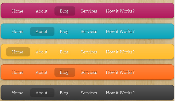
我们的菜单添加更多的各种各样的颜色。
.magenta {
background : rgb(190,64,120);
background : -webkit-gradient(linear, left top, left bottom, from(rgb(190,64,120)), to(rgb(177,24,91)));
background : -moz-linear-gradient(top,rgb(190,64,120), rgb(177,24,91));
border: 1px solid #841144;
}
.cyan {
background : rgb(64,181,197);
background : -webkit-gradient(linear, left top, left bottom, from(rgb(64,181,197)), to(rgb(7,165,187)));
background : -moz-linear-gradient(top, rgb(64,181,197), rgb(7,165,187));
border: 1px solid #2f8893;
}
.yellow {
background : rgb(255,199,79);
background : -webkit-gradient(linear, left top, left bottom, from(rgb(255,199,79)), to(rgb(255,188,43)));
background : -moz-linear-gradient(top, rgb(255,199,79), rgb(255,188,43));
border: 1px solid #c08c1f;
}
.orange {
background : rgb(255,133,64);
background : -webkit-gradient(linear, left top, left bottom, from(rgb(255,133,64)), to(rgb(255,107,24)));
background : -moz-linear-gradient(top, rgb(255,133,64), rgb(255,107,24));
border: 1px solid #c04f11;
}
.dark {
background : rgb(89,89,89);
background : -webkit-gradient(linear, left top, left bottom, from(rgb(89,89,89)), to(rgb(54,54,54)));
background : -moz-linear-gradient(top, rgb(89,89,89), rgb(54,54,54));
border: 1px solid #272727;
}
.magenta li a , .cyan li a, .yellow li a , .orange li a, .dark li a{
color: #fff;
text-shadow: 0 -1px 0 rgba(0,0,0,.40);
}